Every year, the world of interior design welcomes new color trends. One season may be defined by soft pastels, while another embraces bold statement hues. Yet amid the ever-changing cycle of trends, certain colors continue to stand the test of time.
Never overly dramatic yet always impactful, these shades are often considered by designers to be a safe investment for any living space. Their enduring appeal allows them to remain relevant and beautiful for years to come.

Blue-Gray: The Beauty of Quiet Sophistication
Neither as cool as pure gray nor as vibrant as blue, blue-gray occupies the perfect balance between the two. This versatile shade creates a calming atmosphere while adding depth and character to a space. Under natural light, blue-gray walls subtly shift in appearance throughout the day, giving interiors a dynamic yet understated quality.
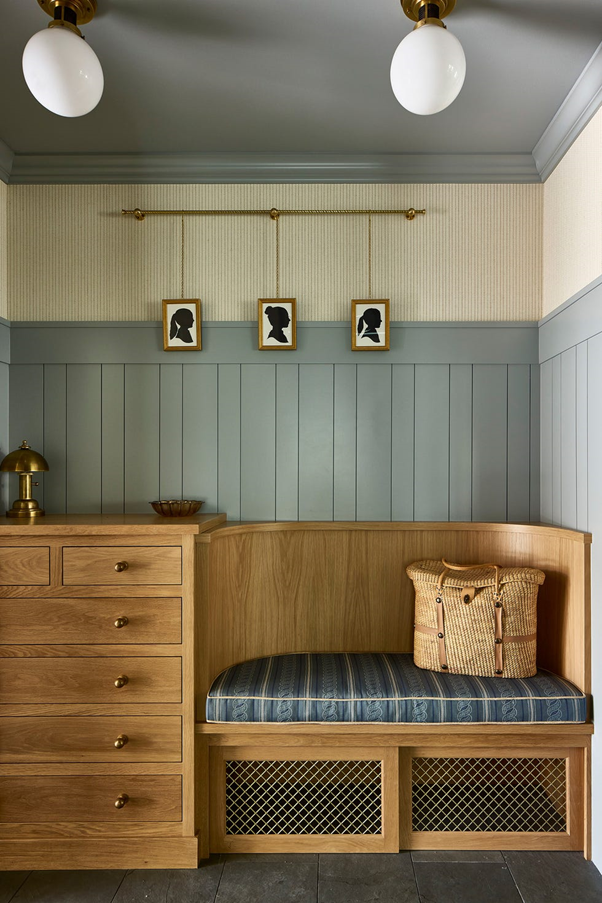
It is also one of the most popular choices for Scandinavian, Coastal, and Contemporary interiors, thanks to its ability to pair effortlessly with natural wood, stone, and metal finishes.
Terracotta: The Warmth of Sun and Earth
Some colors instantly evoke a sense of warmth, and terracotta is one of them. Inspired by sun-baked clay, this earthy hue recalls Mediterranean homes, sunlit walls in Southern Europe, and the timeless beauty of traditional craftsmanship.
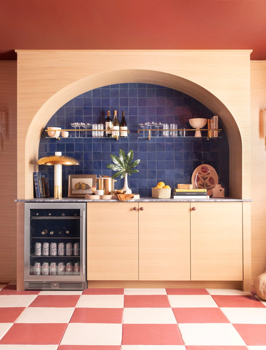
Unlike conventional shades of red, terracotta offers a softer and more natural tone. It is bold enough to create visual interest without overwhelming a room. When combined with wood, rattan, bamboo, or handcrafted ceramics, terracotta brings warmth, authenticity, and character to a home.
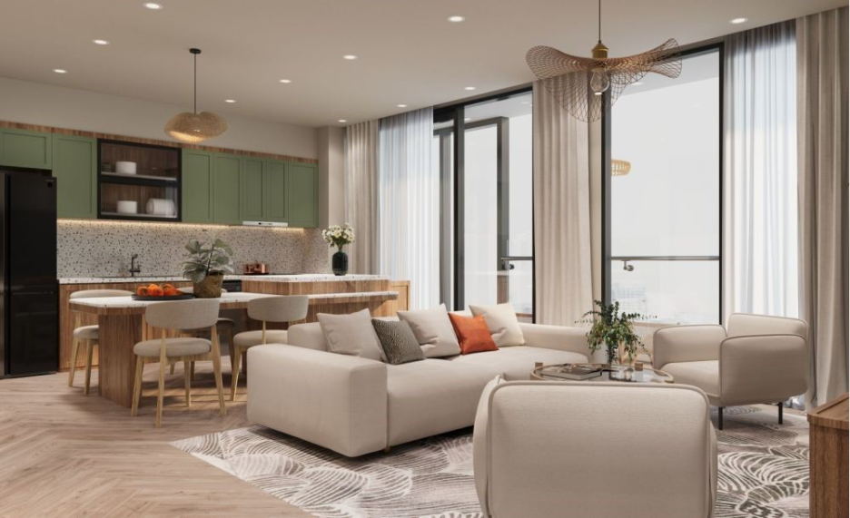
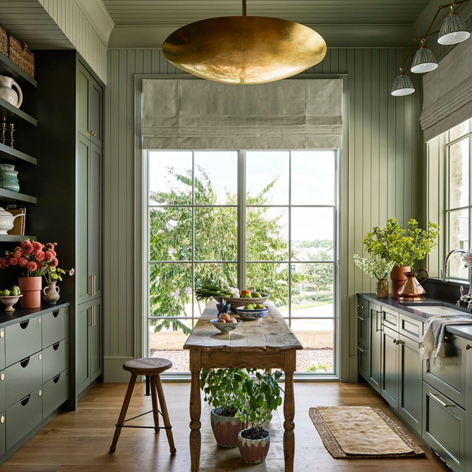
Sage Green: Bringing Nature Indoors
Over the past several years, sage green has become a staple in interior design collections and shows no sign of fading from popularity. This muted green with subtle gray undertones creates a soothing, relaxed atmosphere.
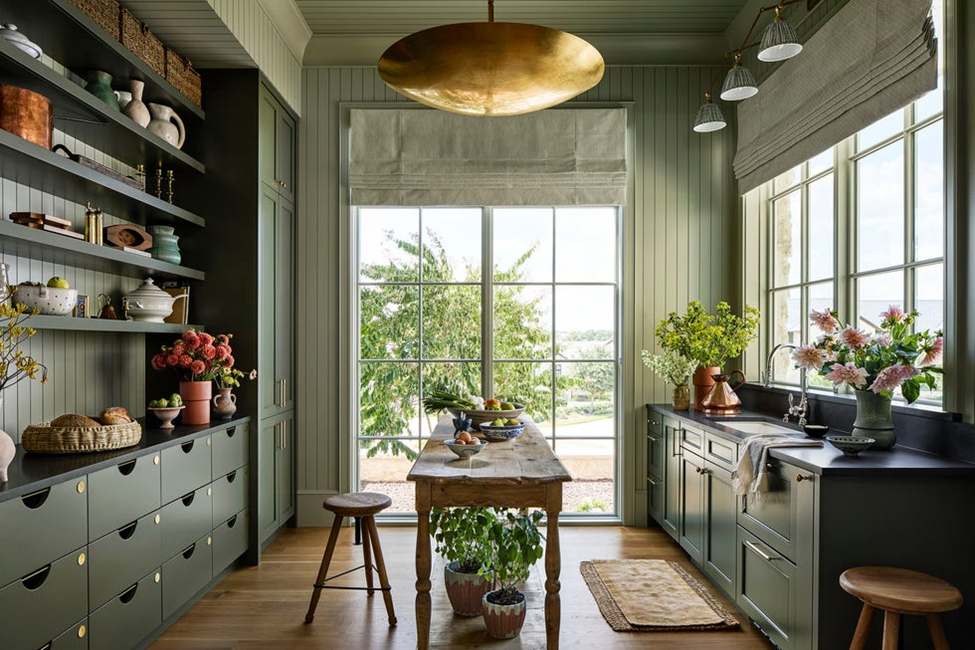
Less vibrant than traditional greens, sage green feels mature, refined, and remarkably versatile. Whether used in bedrooms, kitchens, or bathrooms, it has the ability to bring a sense of nature and tranquility into everyday living spaces.
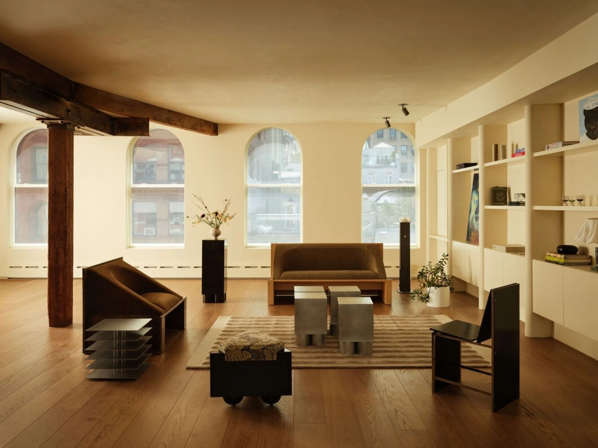
Cream: Effortless Elegance
As many homeowners move away from the starkness of pure white, cream and ivory tones have emerged as favored alternatives. These shades offer greater warmth while maintaining the timeless elegance associated with neutral palettes. Cream provides the perfect backdrop for highlighting furniture, artwork, and architectural details..
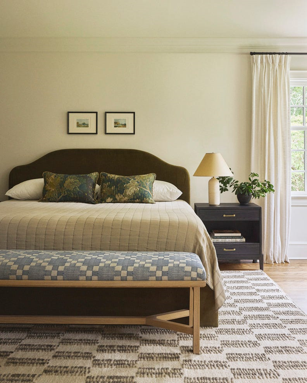
In interiors inspired by Japandi, Minimalism, or the growing Quiet Luxury movement, cream often serves as a foundational element, creating spaces that feel both sophisticated and welcoming.
Vermilion Red: A Statement of Personality
Not every timeless color needs to be subtle. Vermilion red—a vivid red infused with orange undertones—proves that bold colors can transcend trends as well.
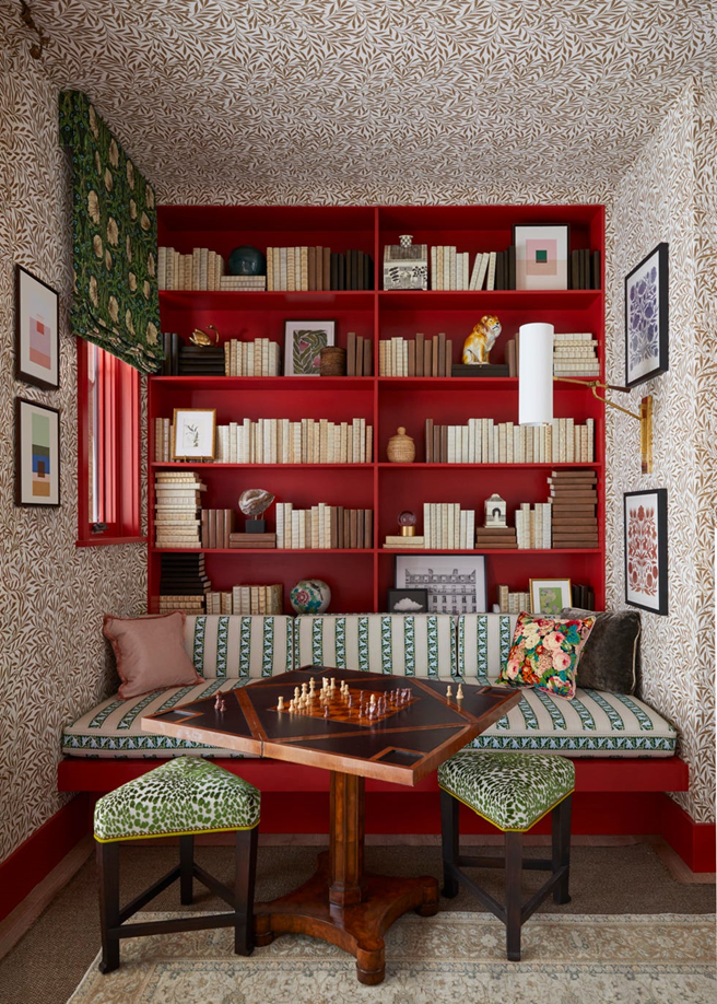
Rather than covering an entire room, designers often use vermilion in more intimate spaces such as reading rooms, family libraries, or home offices. When paired with glossy finishes, the color creates a dramatic visual effect that feels both luxurious and artistic.
The Enduring Appeal of Timeless Colors
Trends may change from season to season, but truly enduring colors are rooted in emotion and the way people experience their homes. Blue-gray offers a sense of calm. Terracotta brings warmth and comfort. Sage green reconnects us with nature. Cream embodies understated elegance. Vermilion red expresses confidence and individuality.
Though they belong to different palettes, these colors share one essential quality: the ability to remain beautiful and relevant year after year without feeling dated. Because ultimately, a beautiful home is not the one that follows trends the fastest—it is the one that continues to bring joy every time its owners return.
Source: House Beatiful.